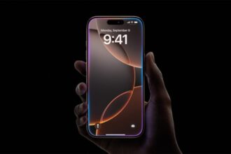


Apple has given the Lock Screen clock a fresh set of tools in iOS 26. You can change the font style, the color, the thickness, and the size of the clock. You can also choose between a glass style that shows the wallpaper behind the numbers and a solid style that stands out more. This guide shows how to use those settings step by step and how to find the new Liquid Glass control if you want the clock to sit naturally with the rest of the interface.

Change clock style
Long-press on the Lock Screen to begin. When the screen enters edit mode, tap Customize. Tap the time to open the clock controls. You will see options to choose Glass or Solid. Glass keeps a translucent look, and Solid gives a firmer block of color. Below those options, you can pick a font. Tap each font to see it previewed on the Lock Screen. Select the thickness slider to make the numerals narrower or larger. Select a color in the picker and move the control of the opaqueness to make the color darker or lighter. To save, tap on the Lock Screen anywhere and then tap Done to save changes.
The clock can also be changed to use another language. Click the globe icon at the clock panel and choose the language you want. The clock will change to reflect such a language format.
Resize the clock
To change the clock size, long-press and tap Customize, then tap the time. Use the size control to make the clock taller or more compact. A larger clock can work well with clean wallpapers and simple images. A smaller clock can help when your wallpaper is busy or when you want more room for widgets. After you set the size, tap Done to apply it.
Widgets appear in two places on iOS 26. You can put small widgets above the time or a wider set below the time. Try different placements to balance the look of the clock and the wallpaper.
Liquid Glass and opacity control are now in Settings. Open Settings, go to Display and Brightness, and then tap Liquid Glass. Choose Clear for the original translucent look or choose Tinted to make the interface opaque. This control makes the clock and other interface elements sit better with many wallpapers. In case you are not receiving the new menu, check that your iPhone is running on iOS 26.1 or above.
Quick tips for better results
Choose a font that is easy to read. Light thin fonts can look elegant, but they may be hard to see in bright light. Test the Glass and Solid options on your most-used wallpapers so you do not lose clarity. If you use an always-on display, check the larger clock size while the phone is locked to make sure it looks right without draining your focus.

What to try next
Try moving widgets above the clock for a compact look. Try moving widgets below the clock for more information at a glance. Change the clock color to match a dominant color in your wallpaper for a neat, cohesive look.
This is a practical way to make your iPhone Lock Screen match how you use your phone. Small changes to font color, thickness, and size can make a big difference for readability and style.