

YouTube Music is rolling out a major redesign to its Now Playing screen on Android and iOS. The new layout moves key controls and adds a dual pane view for the up next queue. The change is a staged server side update that began testing late last year and is now arriving more widely.
Now Playing Redesign
The top of Now Playing now shows the song title and artist, followed by the main control row. The player uses a wider, boxy scrubber that grows when the user touches it. The song video switcher has moved from the top to the actions area. Cast controls remain next to the overflow menu. A compact carousel holds actions like thumbs up and save. Lyrics and Related are still easy to reach.
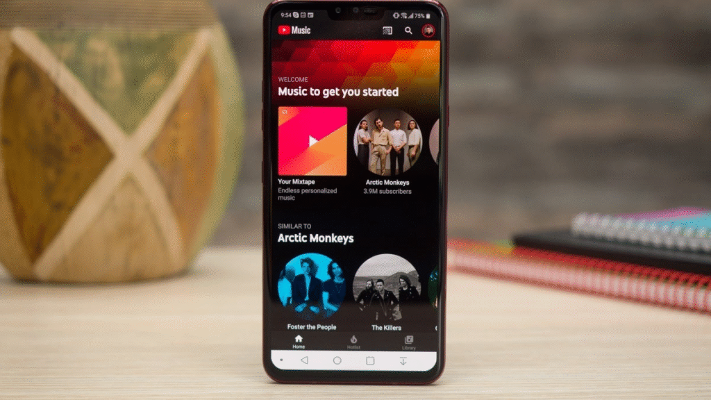
The new dual pane view opens when the user taps the up next handle. That view shows the current queue alongside the player. The queue shows the next few tracks at a glance and can expand to show more. The queue closes when the user exits Now Playing. The redesign also applies to podcasts with matching controls and layouts.
Queue Interaction Upgrade
The update aims to make queue control faster on phones and tablets. Users can tap to open the queue rather than dragging. That helps when the player is used one handed. The compact action carousel keeps controls accessible without taking too much vertical space. Lyrics and Related open in sheets that can be expanded for full view.
Early feedback has praised the new dual pane flow and the faster queue access. Some users have raised concerns about unthemed panels that do not match the app wide look. Other users have noted that the controls are now higher on the screen which can change one handed use. If the redesign has not arrived on a device users can force stop the app and reopen it to try to trigger the server side roll out.
This update will reach users over the coming weeks. It represents a notable shift in how YouTube Music presents playing content and queues. The dual pane option gives clearer control of play order while keeping common actions near the top of the screen.