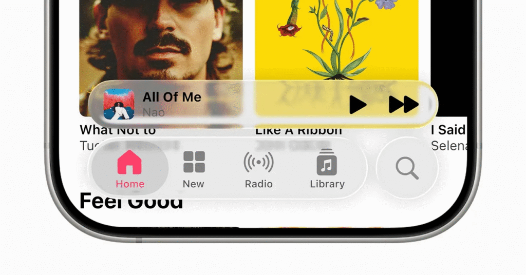
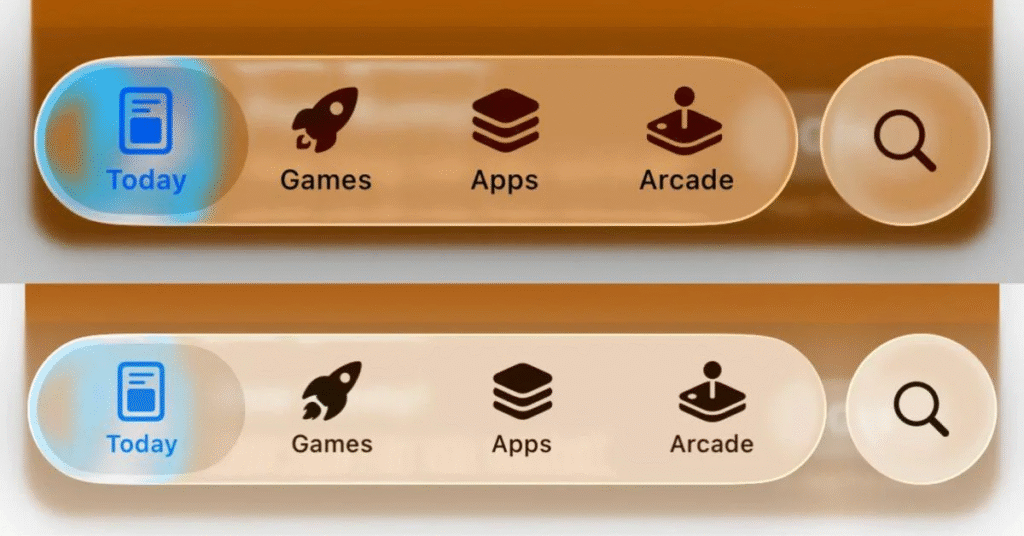
Apple’s Liquid Glass interface now looks more solid. In the third developer beta of iOS 26, the company cut back how much you can see behind navigation bar buttons and tabs. Those elements now appear more frosted and less like clear glass. This change follows user reports that the original glass effect made menus hard to read.

Improving Readability
Early testers said that the strong transparency let background content bleed through. Text and icons in areas such as the Control Center lost contrast and felt washed out. By darkening blur effects and boosting opacity, Apple has given each interface element more visual weight so labels stand out clearly against any backdrop.
Community Reaction
Feedback on the new look is split. Many testers praise the move for making the UI more usable in bright or busy screens. Designers note that higher contrast is key for accessibility and ease of use. Others miss the bold, glass-like style that Apple first showcased at its developer conference. Posts on social platforms call the update a step back and ask for a user option to dial glassiness up or down.
What Comes Next
This update is in the beta test. The company has claimed to rework the Liquid Glass according to the feedback of the developers and testers prior to the official release in the fall. Designers have an opportunity to leave comments using the official Apple feedback assistant. Apple has the possibility of providing controls that will allow users to select the level of frost or clarity on their own.

The balance between style and legibility by Apple demonstrates that the company cares for the functionality of the product in the real world. Now that iOS 26 is approaching launch, there is more refinement we should anticipate. The last design can retain the glass effect and also make sure that all buttons and labels can be read easily.


