WhatsApp’s latest innovation has taken everyone by surprise. The company has created a replacement for the iconic “typing” message, which notified users when someone was writing a message. This historic feature will disappear from its usual location and will also undergo a complete format change.
Please follow us on Facebook and Twitter.
The good news is that WhatsApp will still provide notifications about this, but with a new design that feels more modern. It’s clear that the service has drawn inspiration from other messaging apps for the updated look of this feature.
Additionally, we not only have details on how it works and leaked screenshots, but we can also confirm that it’s already in the beta version of the service. So, it will arrive on your mobile soon. This means you can say goodbye to the classic “typing” notification that has been with you for the past few years.
This is how WhatsApp has changed the “writing” feature.
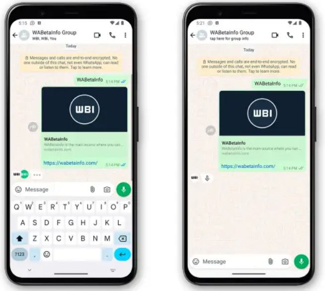
Thanks to WABetaInfo, we can see how the chat interface will change soon. As mentioned earlier, the word “typing” will disappear from the top area, which will now only display the contact’s name and their “online” status. You will no longer see it there when someone is writing a message.
However, WhatsApp hasn’t removed the feature; it has simply revamped it. When this change is implemented, the notification will appear at the bottom of the chat, in a bubble that includes the other person’s profile picture and a three-dot animation that appears and disappears.

Additionally, this new system will account for audio messages by replacing the three dots with a microphone icon. This allows you to know when the other person is recording a message. The “recording audio” icon will also disappear from the top of the chat.
But that’s not all—this new WhatsApp feature will also extend to group chats. When multiple users are writing at the same time, other members will see several bubbles with their respective profile photos.
WhatsApp hasn’t fully explained this feature yet, but it’s likely aimed at adapting the interface for larger screens. The “typing” icon at the top made sense for 4- or 5-inch screens, but having the notification at the bottom seems more practical, allowing users to keep their focus closer to the keyboard.


