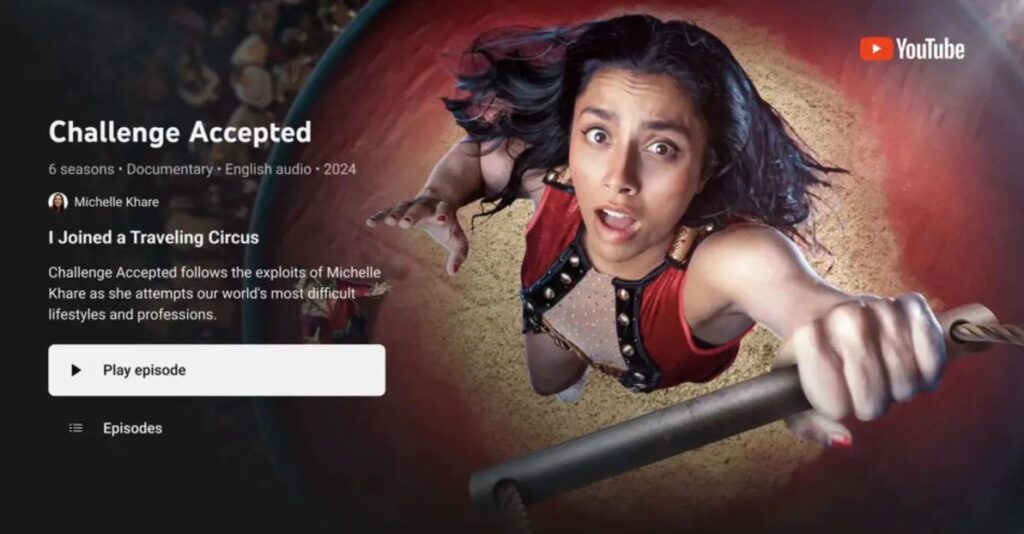
YouTube will redesign its TV app to become more competitive in the streaming market. The video platform will completely change its look, adopting practices seen in competing apps like Netflix and Prime Video. The new features will help content creators make the most of their channels.
Please follow us on Facebook and Twitter.

According to a report from THR, YouTube is updating its app for smart TVs. The redesign will allow YouTubers to organize their content by episodes or seasons, similar to Netflix. YouTube’s interface will shift away from the repository concept to provide a more user-friendly experience for the living room.
To achieve this, YouTube will use Primetime Channels, a feature that groups various streaming services and channels within the TV app. Launched in late 2022, this feature aimed to replace cable television in the United States. While it hasn’t fully met that goal, the concept will help guide the redesign of the TV app.
Christian Oestlien, YouTube’s vice president of product management, stated that many content creators are moving toward the season-and-episode format offered by Primetime Channels. “They’re making 20- to 40-minute videos with a season arc and multiple episodes,” he said. This interest has prompted the platform to make significant changes to how content is accessed on TV.
YouTube will copy the best of Netflix in its new app
The most noticeable change applies to channel pages, which now feature immersive previews. When you visit one of your subscribed channels, a video will play automatically. This view is similar to Netflix, where a video plays in the background while you adjust subtitles or other settings.
YouTube calls this feature “Show Pages,” and all creators will have access to it. “What we’re trying to do is ensure we’re supporting creators and helping them achieve their vision for living room programming,” Oestlien said.
One of the first to adopt this format is Michelle Khare, an American YouTuber known for her video series Challenge Accepted. The new YouTube interface on Khare’s channel organizes content by season, resembling the layout found on Netflix. “It’s a great way for the audience to discover a creator and a show, just like they would when browsing another streaming service,” Khare said.
It’s important to note that while this feature will be available, not all YouTubers create episodic content. Each individual will need to adjust their channel using the necessary tools, though they will receive support from the platform. The redesign also includes a simpler subscription function and QR codes for video links.
YouTube has confirmed that the organization of seasons and episodes will be implemented in the app by 2025.


