
Apple’s update to iOS 26 brings a new look called Liquid Glass. This interface uses glossy and transparent elements to mimic real glass. Apple first showed this design at its June developers conference. Users now have a chance to compare it to the blur and flat style of iOS 18. The two systems share history yet offer very different experiences.
Color and Texture Changes
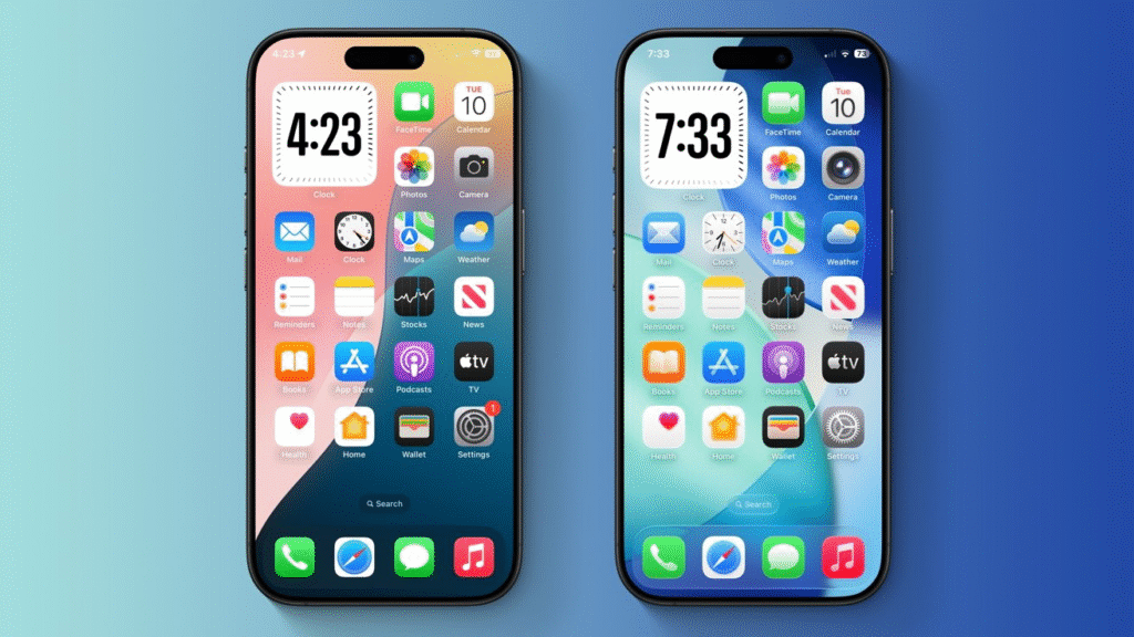
In iOS 18, Apple used bright solid colors with some blur in the background of menus. iOS 26 builds on that by adding translucent panels that refract light in real time. Buttons appear as if they float on a glass surface. Their edges catch light when the screen moves. Users can choose custom folder colors that show through behind icons. This level of throwback to real glass makes the interface feel more dynamic than iOS 18 ever did.
Lock Screen and Wallpaper Effects
On iOS 18 the lock screen had a static blur behind the time and notifications. iOS 26 transforms this area with a glass font that shifts shape as the background image changes. Wallpapers now adjust to everyday movements and light changes. Users can turn photos into depth aware images that appear three dimensional. This effect was not available in iOS 18 and gives iOS 26 a fresh visual feel right at first glance.
App Icon and Widget Updates
App icons on iOS 18 follow a flat square style with rounded corners. In iOS 26, those same shapes now rest on a frosted glass background when placed on the home screen. Widgets also use glass cards that let background colors gleam through. The silhouette of each icon and widget floats above the desktop wallpaper. This design unifies the look of the home screen more than the iOS 18 layout.
Control Center and Menus
The control center in iOS 18 used solid panels and distinct buttons. iOS 26 changes those panels into glass sheets that fade into the background as you scroll. The buttons remain bright for clarity but appear to sit on a glass shelf. Settings menus follow the same style, adding a sense of depth. While iOS 18 offered quick access, these updates make the interface feel more alive without changing where taps take you.
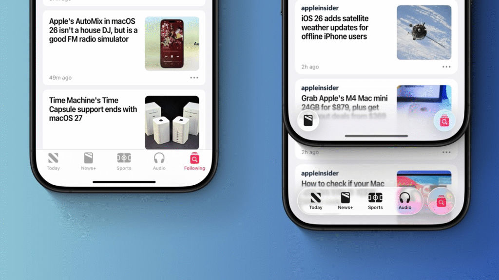
Safari and App Screen Real Estate
Safari in iOS 18 kept the address bar fixed at the top of the screen. iOS 26 lets you scroll down to hide the bar and gain full-screen space. The bar then reappears when you swipe back up. It also floats on a glass panel above the page. This gives a cleaner view of articles and photos. The same glass effect appears on many built-in apps, giving them a unified appearance.
Camera and App Icon Simplicity
The Camera app in iOS 18 had multiple buttons that could crowd the viewfinder. In iOS 26, Apple simplified the choices to photo and video modes. Other functions hide in a glass menu at the top of the screen. This minimalist style helps new users take pictures more easily than the dense interface of iOS 18.
Third-Party App Consistency
iOS 26’s glass style will ripple into third-party apps. Developers now have a design template that matches Apple’s own apps. This unification helps reduce the jarring shift users saw when switching from iOS 18’s system apps to third-party tools. In time, the entire app ecosystem will feel more coherent under iOS 26.
Performance and Compatibility
All these glass effects rely on the A18 chip’s powerful graphics engine. iOS 18 ran on older chips and could not support real-time light refraction. That is why Apple dropped support for some older models from iOS 26. Devices such as the iPhone XR and XS from 2018 do not run iOS 26. This ensures the new design runs smoothly without lag.
What Users Really Get
Beyond the new look iOS 26 brings many features to match its name. Apple Intelligence now works system wide offering summaries and smart tools in notes and messages. Live translation adds subtitles in phone calls and video chats. Spotlight can send an email or set a reminder without opening another app. These changes mark a shift in how users interact with their devices.
iOS 26 vs iOS 18: A Final View
iOS 26 may not match the shock of iOS 7’s first flat design. Yet its Liquid Glass style builds a clear identity for the future. It keeps the bright color palette of iOS 18 while adding dynamic transparency. Users who prefer a more lively interface will appreciate the glass effects. Those who value simplicity can still find the same layouts they know.
The update is not just a new lick of paint with updated apps and system-wide AI. Apple connects design with new features that make the whole process more contemporary and interactive. As testers try the public beta, they will shape the look and feel before the final release this fall. The stage has now been set for the next decade of Apple software design to shimmer with Liquid Glass clarity.


