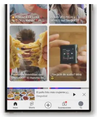
It took YouTube three weeks to reverse its decision. The world’s most popular video app has just removed a feature it spent months developing and rolled out in mid-October to all users’ phones. After receiving thousands of complaints about how it worked, the company decided to remove the new mini-player that users have been dealing with over the past few weeks.
Please follow us on Facebook and Twitter.
On October 23, we reported that the YouTube app had been updated to include a more advanced mini-player. This updated version featured a modern design and the ability to move it around the screen. However, it seems that the feature’s rollout has not been successful.
Thousands of users reported frequent crashes, poor interface integration, and other occasional issues. YouTube’s response was straightforward: return to the old system. That’s right—an update released yesterday replaced the new mini-player with the previous version. Instead of fixing the issues, YouTube decided to simply remove the problematic feature.
So, if you’ve noticed YouTube going back to the familiar bottom bar with a video thumbnail and a couple of controls, don’t worry—it’s not a glitch or your phone reverting to an older version. This change is YouTube’s way of addressing user complaints.
If you enjoyed the new mini-player, unfortunately, you’re out of luck. There doesn’t seem to be any way to bring it back. The update removing it is rolling out, and within hours, the revamped mini-player will likely disappear completely.

YouTube Has Learned a Lesson: Functionality Over Aesthetics
The complaints about the new mini-player are justified. While the updated design takes up more screen space, it also requires extra effort to close. Unlike before, the mini-player doesn’t display an “X” button to stop playback in the small format—you need to click on the window first for the option to appear. Additionally, the names of the video and its creator are no longer visible, making it less user-friendly.
These might seem like small details, but it’s clear that YouTube removed some very useful features from the new mini-player. While the updated design may look more modern and visually appealing, it delivered a worse user experience. The company assumed users wanted this space primarily to keep watching videos in a small format, but many actually use it to listen to videos while browsing for others in the app.
If you were one of those users, congratulations—you’ve won. Now, you can once again enjoy the classic mini-player, which may not be as sleek but is far more functional.


